View From A Bridge
View From
A Bridge
Brian D. Cohen
Brian D. Cohen is an educator, artist, and writer. In 1989 he founded Bridge Press to further the association and integration of visual image, original text, and book structure. Brian has shown in forty individual exhibitions, including a retrospective at the Fresno Art Museum, and has participated in over 150 group shows. Cohen's books and etchings are held by major private and public collections throughout the country, including Yale, Harvard, Brown, and Stanford Universities, Middlebury, Smith, Wellesley, Swarthmore, and Dartmouth Colleges, the University of Vermont, The New York Public Library, The Library of Congress, and the Philadelphia and Portland (Oregon) Museums of Art, as well as the Victoria & Albert Museum in London and the United States Ambassador's residence in Egypt. Brian was the first-place winner of major international print competitions in San Diego, Philadelphia, and Washington, DC., was awarded the Best Book in Show at the Pyramid Atlantic Book Fair, and has received grants from the Vermont Arts Council and the Vermont Community Foundation. He is the illustrator of two popular natural science books, Reading the Forested Landscape and The Granite Landscape, and is a frequent contributor of artwork to literary reviews and other publications, including the Paris Review. A book of his work, Brian D. Cohen: Etchings & Books, was published in 2001. His essays on arts education are a feature of the Arts and Culture section of the Huffington Post.
website
www.bridge-press.com
email -
Golgonooza
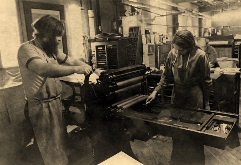
[Captioned photo circa 1983. Printing on a Hacker Hand Press, in Ashuelot, typesetting John Hersey's: ‘Hiroshima’ with silkscreen illustrations by Jacob Lawrence.
http://nhpr.org/post/archives-golgonooza-two-poets-share-passion-book-printing]
Thirty years ago when I became a resident of Vermont, I thoughtlessly adopted a full-blown set of prejudicial notions about New Hampshire. These particular assumptions reminded me of the cross-river rivalry I had grown up with in Philadelphia about New Jersey, equally unexamined and glib and superficial. At the heart of these notions was the blanket assumption that residents of New Hampshire lack the refinement, talents, accomplishment, and open minds of their neighbors to the west; in short they’re rednecks. While Donald Hall evens the score with Vermont with his essay “Reasons for Hating Vermont,” only later did it occur to me, eager as I was to fit in Vermont, to cross the bridge and see for myself.
I had occasion to visit the Golgonooza Letter Foundry & Press, in Ashuelot, New Hampshire, in 1991, to discuss a visual book I was working on. I had printed my first book, based on Dante’s ‘Inferno’, on a commercial offset press before learning that letterpress, a direct form of relief printing with no mechanization or photographic means of transfer, was preferable. Golgonooza (a mythical city of artist/poet/printer William Blake) was Dan Carr and Julia Ferrari, type founders and letterpress printers, two obsolete occupations carried on by poets who couldn’t get their work printed anywhere else, and by artists whose work incorporated the written word and demanded the greatest refinement and subtlest impression.
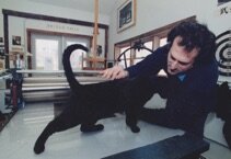
At the start of any visit, after 45 minutes on politics, local to national, and back to local, and after admiring Bear and Mr. Clark, their two very fine and very ample cats, we would seek out unoccupied level space on which to place whatever project of mine I wanted to show Dan. It would take another ten minutes to find a clearing, usually by shoving to the side something I’d rather be looking at, a Spanish and English setting of poems by Pablo Neruda, a poem by Li Po printed from Chinese characters cast by Dan from recently discovered matrices, or one of Dan’s own poems exquisitely printed with an etching by Julia on Japanese paper as a keepsake for friends.
Dan was a poet active in the Small Press Movement in the late 1960's and early 70's. He contributed to and co-directed the Four Zoas Press in Ware, Massachusetts, which published a poetry journal called the Four Zoas Journal of Poetry and Letters, uniting Dan’s political and poetic concerns. Four Zoas took on typesetting and printing jobs for other publishers in order to support the press. Julia, a painter and printmaker, joined the press to learn how to print. They began to collaborate, terming their work "the Whole Art of Language" because they joined typography and hand printing with the beauty of language. Dan and Julia founded Golgonooza Letter Foundry & Press in Boston in 1979, moving three years later to a large brick building in Ashuelot, New Hampshire (population, maybe 300). Golgonooza collaborated with the Limited Editions Club in New York on many book projects, including John Hersey’s ‘Hiroshima’, a selection of the poems of Frank O’Hara illustrated by Willem DeKooning, and a magnificent setting of the Biblical Genesis with illustrations by Jacob Lawrence. These volumes are among the most beautiful and sought-after livres d'artiste created in the past fifty years. Though I would not presume to add my own books to that statement, Dan and Julia were responsible for the text of ten of my own books.
Ashuelot is a small town with a covered bridge and a fire department, and but for Dan and Julia’s firm intervention, a proposed ATV racecourse. Their print shop occupied a long brick mill dormitory building on the east side of Main Street. The shop seemed enormous, endless in my mind, because the walls could not be seen, the floor only in a narrow path, blocked by the most complicated of machines, covered with reams of printed matter, stacked with galleys of set type waiting to be printed, distributed, or melted down. The endlessness, the boundless fascination of the space, its every inch inhabited with textual and visual treasure, was a living memory palace, and Dan and Julia its tutelary deities. When I saw them outside the shop, gracious as ever, they seemed somehow just a little out of place.
Letterpress printing was developed in the 15th C by Johannes Gutenberg, though as with many things, the Chinese had figured it out quite a bit earlier. Gutenberg’s development involved the bringing together of several concurrent innovations: the casting of movable type from adjustable molds, and the use of oil-based ink and a wooden screw press for printing. The copper molds into which a lead alloy would be poured to cast type were themselves created from steel punches that possessed every characteristic of that typeface in every letter (upper and lower case) and character. Punchcutting is the sculpting of a letter on a piece of steel (the punch), which is carved, cut, and gouged using hand gravers and files at the exact size the type would be printed (though the system of type sizes had yet to be formalized, each capital letter Gutenberg Bible is barely larger than ¼”).
While Julia created illustrations, printed on the presses, bound books, proofread, edited, and composed type for the Monotype, Dan worked with metal in its molten and hardened forms. One area of the shop held a complete machine shop with milling machines, pantographs, drill turrets, lathes, grinders, and benches with gravers, files, micrometers, counterpunches, and loupes. The metal of his machines was burnished from a history of long use preceding Dan, but remained always precise, exact, like the wood of a 17th C. Cremonese violin. Dan knew his several finicky Monotype casters intimately, and would interchange parts among them when needed, or machine his own pieces from blank steel stock. These machines cast characters from copper matrices with compressed air, dictated by a punched tape. The molten type metal (an alloy of lead, antinomy, nickel and other metals; Dan had his own proprietary formula) was pumped under pressure through a fine nozzle, while water kept things from overheating. It had more vents, passages, tubes, and moving parts than a steam engine.
I have not known anyone so sensitive to type forms as Dan was. He explained to me how most digital fonts merely enlarged a smaller size to a larger, while earlier type designers subtly reworked every element of the letterform to suit each increasing point size. He knew the arcana of typographic history, and in a broadside he set and printed for me insisted that Nicholas Kis be properly credited for designing the type that has for over 300 years has borne Anton Janson’s name, righting a three-century old misattribution. Dan was a brilliant scholar of the written word; in his own translations of the 8th C. Chinese poet Li Po (for which Dan taught himself Mandarin Chinese); in his research of the development of letterforms in archaic Greek and subsequent cutting of a new Greek typeface, Parmenides; and in his study of the development of printing from moveable type in China, which anticipated Gutenberg by at least four centuries. Historical and aesthetic awareness informed his work; he spoke of the tradition of Aldus, Garamond, Fournier, Bodoni, and Baskerville as vital and ongoing. Though there was some recognition in this work there was little profit; Dan reminded me, a bit obliquely, that Gutenberg died forgotten and poor. Dan studied the typographic art of punchcutting with French masters in Paris, and was the only American ever awarded a ‘Maitre-Graveur Typographe’ by the Imprimerie Nationale. He brought to the process of sculpting resistant steel both his exquisite sensitivity to shape and form and extraordinary precision. No brain surgeon or concert violinist had more sensitivity or control than his hands possessed. Dan designed five typefaces, two for letterpress: Regulus and Parmenides, and three digital typefaces, ‘Cheneau’, ‘Lyons’, and ‘Philosophie’.
Dan’s love for poetry, music, most things Chinese, the environment, politics, art, printing machinery, and cats was all of a piece. Dan was so invigorated by the 2004 Howard Dean presidential campaign, and so offended by the folly of the then incumbent president, that he sought election to political office. He lost (barely) his first race for the New Hampshire state legislature, but undiscouraged, he ran again and won in 2008. I lent him some thirty-six-line (6 inch) Gothic condensed 19th C wood type for his campaign posters; he joked that he was likely the only candidate for political office in the country whose lawn signs were printed letterpress from antique wood type. He surveyed the rocky political topography of New Hampshire and recognized where his voice would be heard and his efforts would be most effective: in environmental legislation and Native American affairs. He was almost altogether lacking in cynicism and rarely discouraged; he believed in the possibilities of public action and effective political engagement. As a political representative, and as a teacher as well, Dan was giving and gentle, patient, informed and informative, never self-righteous.
I was a little possessive of Dan and Julia’s time, for the benefit of my own projects, and a little bemused when Dan put in a new wood pellet heating system into the vast shop and home, including a ten-ton outdoor hopper for the fuel. He did much of the work himself, throughout their shop and home. He was justly proud, but put off other work, including mine, in the four months it took to complete it. So much of the world outside Dan and Julia's shop demanded their attention; it’s remarkable that they were so prolific as poet, painter, printer, typographer, designer, and publisher, though I had to learn that some deadlines had to be flexible.
Dan died in June of 2012 at the age of 60. Julia writes movingly of the loss and with gratitude of the time they had and the shared adventure of the work they did. Julia feels compelled to complete his unfinished work and to keep the study and use of metal types alive, as she continues to paint and make prints. After learning that Dan had not fully completed several numerals for Regulus, Julia has set about learning the art of punchcutting, traveling in the spring of 2013 around Europe to learn as much as possible about the cutting and casting of type. As part of a revival she refers to as the “refounding” of Golgonooza, Julia plans to find a distributor for Dan’s digital fonts, publish a book on the history of the press, continue to study type cutting and casting, and to establish a typographic center in Ashuelot. She has lately been working with several dedicated students at the press.
The word ‘genius’ is associated with the attendant spirit of a person or place. Dan and Julia, with their aesthetic vision, skills, tools, and machinery, elegantly and indelibly impressed from metal to paper the voice of the word, in their books, typefaces, and poetry, craft met art, the visual and verbal united. There is unexpected genius in quiet corners of New Hampshire. The genius of Golgonooza endures.